
Tag: tungsten
-
Formal Earthtones
This custom set is adapted from our Mount-Hood-inspired Peak invitation, but without the peak. PAPER Oversized 300g Somerset Soft WhiteINK Tungsten & DustENVELOPE LINER Dust
-
Purple Petal
For fellow Portlanders Nathan and Liene, we created a customized variation on our Petal invitation. We kept the round corners and multi-tone orchid art, but changed the fonts, orientation, and inks.
-
Anniversary Foil
For us, 2015 has been the year of foil. Check out these awesome foil stamped employee recognition cards we printed for Canada’s Ian Martin Group. All six sets were printed with gold foil on 600g Ecru Lettra paper, then finished with gold edge paint.
-
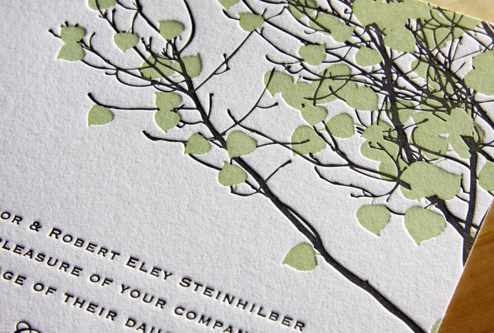
Shades of Blush
David and Allyson’s invitation set was based on Petal, which features an original illustration by Parklife Press. The text, set in all-caps Gill Sans, is set off by the lightly-flourished script of their names. The asymmetry of the single, flowering branch — printed in tungsten and blush inks — provides a fresh and cheerful balance…
-
Minimalist in Long Island City
After seeing the Parker invitation design featured in Martha Stewart Weddings, Liz and Adriel were drawn to the classic look of the invitation. They knew they wanted letterpress invitations; in Liz’s words, they were “choosing to send physical invitations in a digital world,” so the texture of the imprinted text and the feel of the…
-
Summer Vail
Emily and Dylan’s adaptation of our Vail invitation is great. We changed the Tangerine ink to Light Celadon and opted for Fluorescent White paper instead of Ecru and the look, once warm and autumnal, became bright and fresh — perfect for their summertime wedding. We carried the look through to the place cards and thank you…