
Tag: thank you notes
-
Cards and Notes for PhoneLove
For the Portland-area phone lovers at PhoneLove we printed two-sided business cards on 600g Fluorescent White paper. Most featured purple on both sides, while select folks got a subtle tinted-white logo for a blind-deboss look. We rounded out the set with some folded notes.
-
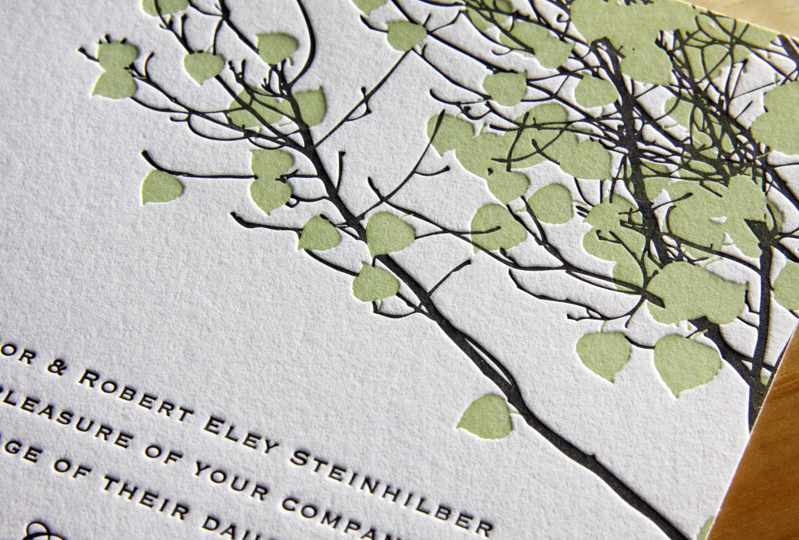
A Wedding Between Two Ferns
Last month we featured Luke and Robyn’s Mount Hood wedding invitation set. Sticking with the Oregon theme, this time we head south for Julia and Detlev’s wedding on the Umpqua River. Both the wedding ceremony invitation and the rehearsal dinner invite feature fern imagery – somewhat abstractly on the main invite and more realistically and delicately for…
-
Gold Leaves
Here’s a set we did which shows off new technique. (Well, new to this blog … the technique itself is hundreds of years old.) Overall, it’s sort of a modified combination of elements from Whirl and Vignette, with a custom, gold-foil-stamped art element. This set included an RSVP card with printed return address envelopes, and…
-
Ontario Romance on Lake Muskoka
This was a fun set to design, as it featured custom hand-drawn illustrations incorporating many personal details from the day — a cozy cottage on a pebbly lake shore, the family dog, and the couple’s name waving in a banner. Printed on pearl white paper in stone and peacock inks, the artwork’s color palette had…
-
Minimalist in Long Island City
After seeing the Parker invitation design featured in Martha Stewart Weddings, Liz and Adriel were drawn to the classic look of the invitation. They knew they wanted letterpress invitations; in Liz’s words, they were “choosing to send physical invitations in a digital world,” so the texture of the imprinted text and the feel of the…
-
Summer Vail
Emily and Dylan’s adaptation of our Vail invitation is great. We changed the Tangerine ink to Light Celadon and opted for Fluorescent White paper instead of Ecru and the look, once warm and autumnal, became bright and fresh — perfect for their summertime wedding. We carried the look through to the place cards and thank you…
-
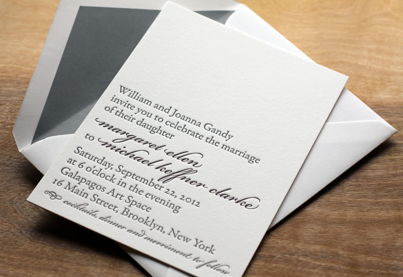
Scripted Bookplate
In this variation on our Bookplate invite Maggie and Mike softened the look a little bit by adding some Bickham Script type in Deep Plum ink for their names and the reception line. Slate envelope liners to match the Slate ink give the set some added polish. Rather than over-stuff the envelope with accommodations info,…