Tag: silver
-
Dueling Cyclops
REALLY thick business cards for Kris Seymour of Cyclops Creative. We did two versions, one with black ink on Antique paper and one with silver ink on black. VERSION 1PAPER 60pt Antique Rising Museum BoardINK Black VERSION 2PAPER 60pt Black Rising Museum BoardINK Silver
-
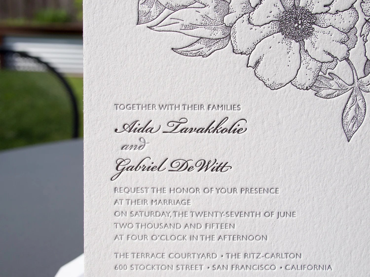
Foil + Foliage in the Brooklyn Botanic Garden
For Taryn and Adam’s wedding in the Brooklyn Botanic Garden, we designed a custom foil + letterpress motif based on the garden’s Palm House. Take a look at the inspiration: We carried parts of the artwork through to reply cards, menus, programs, and even the envelopes. PAPER 600g Fluorescent WhiteINK Light CeladonFOIL Silver Shine
-
Fluorescent Festivities | Neon Nuptials
These might be my favorite client-designed invitations this year. The bride, Nisha, designed three different invites for her various California wedding festivities. All three have a common feel — employing the same border art, black ink, and copperplate type. But Nisha used different title art for each and we printed them with three different fluorescent letterpress…
-
Four Inks on Black for Alex Jackson Studio
Letterpress printing on black paper can pose challenges. Most letterpress inks are transparent, so they’re not going to show up on a black background. One exception is silver. Silver ink is mostly opaque (about 80%), so if you’re sneaky, you can print a silver ink run on the black paper to create a lighter base,…
-
Foiled & Monogrammed
We love type-only designs. This one’s got a simple monogram in Italic Garamond along with text in Neutra Light and Sloop Script. We used a custom paper — two sheets of Dark Gray 350g Colorplan duplexed to create a nice, thick 700g stock. The card was printed with silver foil, finished with silver edge paint, and…
-
Custom Monogram in Santa Fe
Ah, the blind-pressed monogram. Hard to go wrong when you use a lightly tinted white ink with a deep impression on thick cotton paper. We carried the variations of the monogram through to each piece — an accommodations card with a tear-off reply card, a menu, table numbers with a blind chevron pattern and inkjet numbers, and programs…
-
PDX Sports Fan Letterpress Coasters
Looking for the perfect gift for your beverage-sipping Portland sports fan friend? Well shoot, these aren’t for sale. But if they were, they’d be perfect… if not a little pricey. We printed the Timbers side with two inks on 300g Fluorescent White Lettra. On the opposite side, we printed a modified Trail Blazers logo with silver and red inks on…
-
A New Year’s Swirl of Silver and Gold
Katie and Seth were getting married on the eve of New Year’s Eve, in Portland, Maine. They wanted a simple, elegant look — and getting married so close to holidays, they knew they wanted invitations that looked wintery without looking Christmas-y. They found the Whirl design and knew it would work well with their wedding…