
Tag: reply card
-
NEW 2019 Letterpress Wedding Invitations
Five new letterpress wedding invitation designs are out! Let’s take a look: FERN Tonal green-on-green letterpress with crisp copper foil, Fern is one of three new 2019 designs on our Parklife Colors paper. Great for island weddings, rainforest rehearsal dinners, deep woods baby showers, you name it. We like to pair the Forest green invitation…
-
Coquette + Fiore
A perfect combination of our Coquette and Fiore invitation designs. Garamond caps and Aphrodite type in Fog ink along with the blind pressed Fiore art.
-
Black and White Bookplate
We’ve printed all sorts of variations on our Bookplate invitation design since we introduced it in 2011. This may be the starkest, simplest version — with Black ink on Pearl White paper. Jennifer & Haley gave us their own logo/monogram to add to the reply card and envelopes.
-
Prucinsky | Deford Wedding Invitations
Simple but spectacular one-color invitations designed by the bride, Jessica, and printed by us. PAPER 300g and 600g Pearl WhiteINK Midnight
-
Belvedere in Lavender
Our Belvedere invitation is traditionally rather formal — printed with a graphite ink and a blind impression for a bold but stark feel. But Maura and Matthew wanted something a little more playful and a touch more Downton Abbey. So we swapped out the Mrs Eaves text and Burgues Script for the more lighthearted combo of…
-
A Gold-foiled Whirl
For Courtney and Ben’s set, we started with our popular Whirl invitation, but added gold foil and edge paint for some extra pizzazz. The original Whirl uses gold ink, which has just the slightest hint of metallic shimmer. But gold foil is something else entirely — it’s extremely shiny with a reflective mirrored look. And…
-
Ostrich Invitations
At the time of this post, a Google image search for “ostrich wedding invitation” turns up not a single invite with a full ostrich. Ostrich feathers, sure. But no full birds. Chia and Kendall sought to change that, and we were happy to help. Using our Fountain invitation as a template, we added a confidently-posed…
-
Antique Black Champagnium
Back in April of 2015 we printed some excellent business cards for designer Amanda Benincasa. And then a few months later, she asked us to print her wedding invitations. The background floral image is actually just Pantone black ink — but when printed on the black Rising Museum Board, it creates a sort of bronze…
-
New Parklife Invitation Style: Paige
Occasionally we design a custom invitation for a client, and we love it so much we decide to keep it for ourselves. This one, originally designed for Paige and Clayton’s January wedding, will soon be added to Parklife’s wedding collection. The new Paige invitation set is printed with black ink and a blind impression on…
-
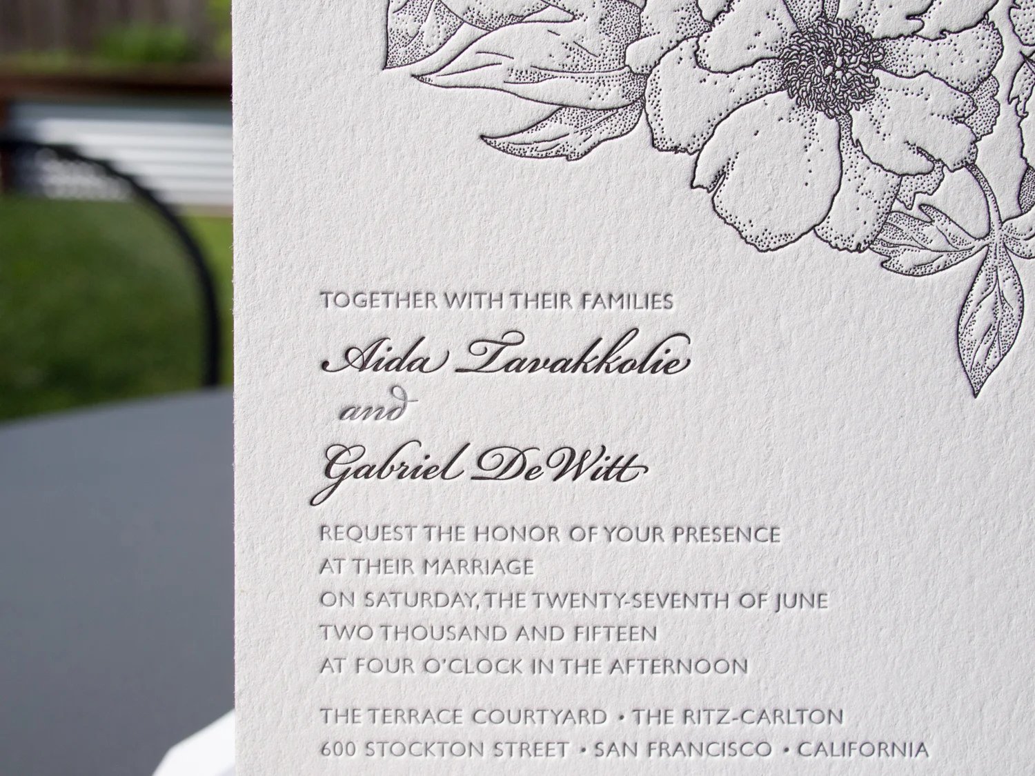
Ontario Blossoming
Gabriel & Aida saw two of our most popular wedding invitations, our Ontario and Blossom styles, and asked, “why choose?”. Why not Ontariossom? Or Blosstario? With our help, they combined the modern typefaces and sleek black / white / silver color scheme of our Ontario style with the classic floral motif from our Blossom design.