Tag: pearl white
-
Our Letterpress Halloween Card = 15% Off Business Orders
Whoa. Check out this hot-off-the-press Halloween card — designed and printed right here at our Portland studio. On the outside it features a medium gray ink and a 50/50 mix of transparent and opaque white on 65# Neenah Astrobrights Cosmic Orange. And on the inside it’s the same gray ink plus a custom orange on 90#…
-
Letterpress Posters for Bowdoin College
Barry Mills served as president of Maine’s Bowdoin College from 2001 until this past July. Upon his departure, the college asked us to print his manifesto as a 6″ x 15″ letterpress poster. Since we use a Chandler & Price platen press, which isn’t really designed for larger pieces like this, we actually printed this…
-
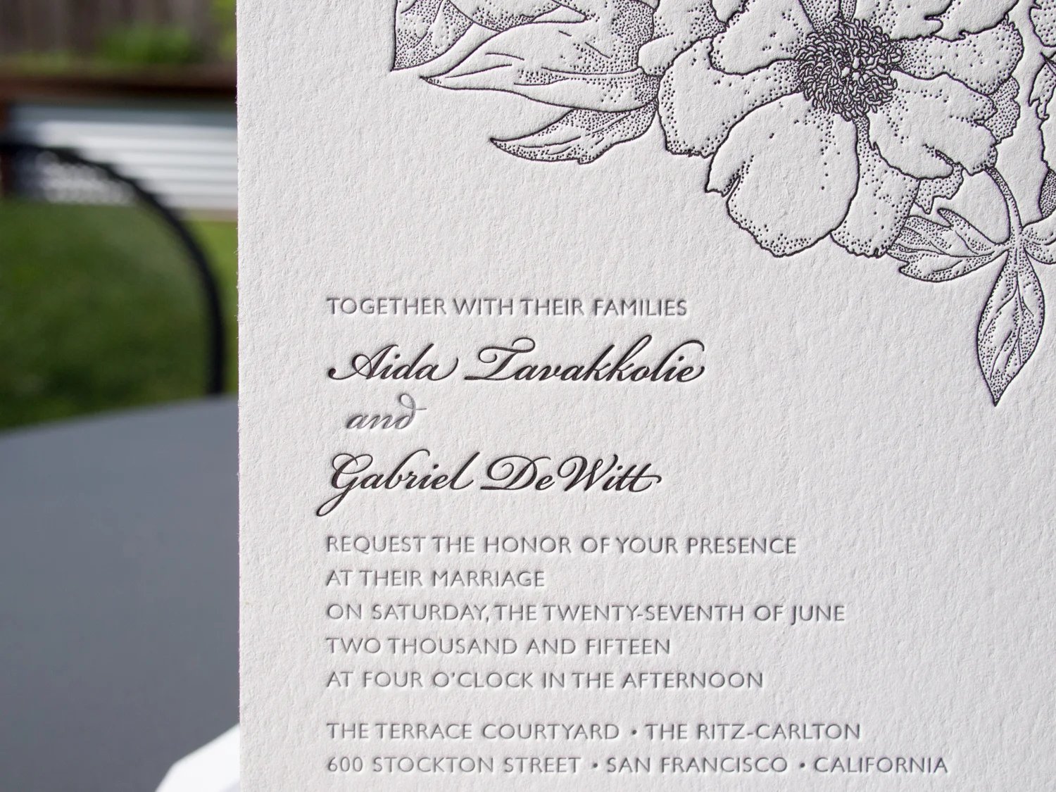
Golden Botanicals Wrapped & Sealed
If you thought the letterpress save the dates we printed for Randi & Ben this spring were cool, I think you’re gonna like the follow-up. This was truly a collaborative project. Randi designed the two-sided invitation and sleeve, and sent the specs off to us. We printed the front of the invitation on 300g Pearl…
-
Foiled & Monogrammed
We love type-only designs. This one’s got a simple monogram in Italic Garamond along with text in Neutra Light and Sloop Script. We used a custom paper — two sheets of Dark Gray 350g Colorplan duplexed to create a nice, thick 700g stock. The card was printed with silver foil, finished with silver edge paint, and…
-
Foil, Door Tags, and Alligators
It’s great when we get to work with a wedding client from the very beginning – starting with the save the dates, moving on to the invitations, and then following through to the wedding day pieces. We did this for Elisa and Alexander, shifting the design vision slightly throughout the process while still maintaining a cohesive…
-
Botanical Postcards
This two-sided client-designed save the date postcard combines light warm gray letterpress ink for the front with flat inkjet printing on the back. The botanical image has wonderful ornate detail while the R+B monogram on the back is simple and clean. The two styles work beautifully together. When printing two-sided, we can use letterpress for both, but it’s…
-
Leaves in Motion
This cheerful set was based on Parklife’s Antiquity. It’s one of our most popular designs. As we describe on the site, “The overlapping light and dark motifs give this invitation a sense of motion that’s unlike anything else in our collection.” This version has been modified a bit: the couple chose pearl white paper and…
-
Roses in Rockville Centre
This was a set based on the Franklin design. Printed on 600g Pearl White stock in Marine and Periwinkle inks, the design has striking text printed over a delicate, floral background. The invitation, along with a reception card, RSVP card and envelope, were held together within the outer envelope by a monogrammed belly band in…
-
Mapping Napa
Nick and Hadley were drawn to the ever-popular Bookplate, and chose a color palette of fresh green paired with a soft gray (apple and dust inks). Their set included a map, custom-designed by Parklife Press, to guide their guests around the Napa Valley wedding events. The set is comprised of three pieces printed on extra…