
Tag: green
-
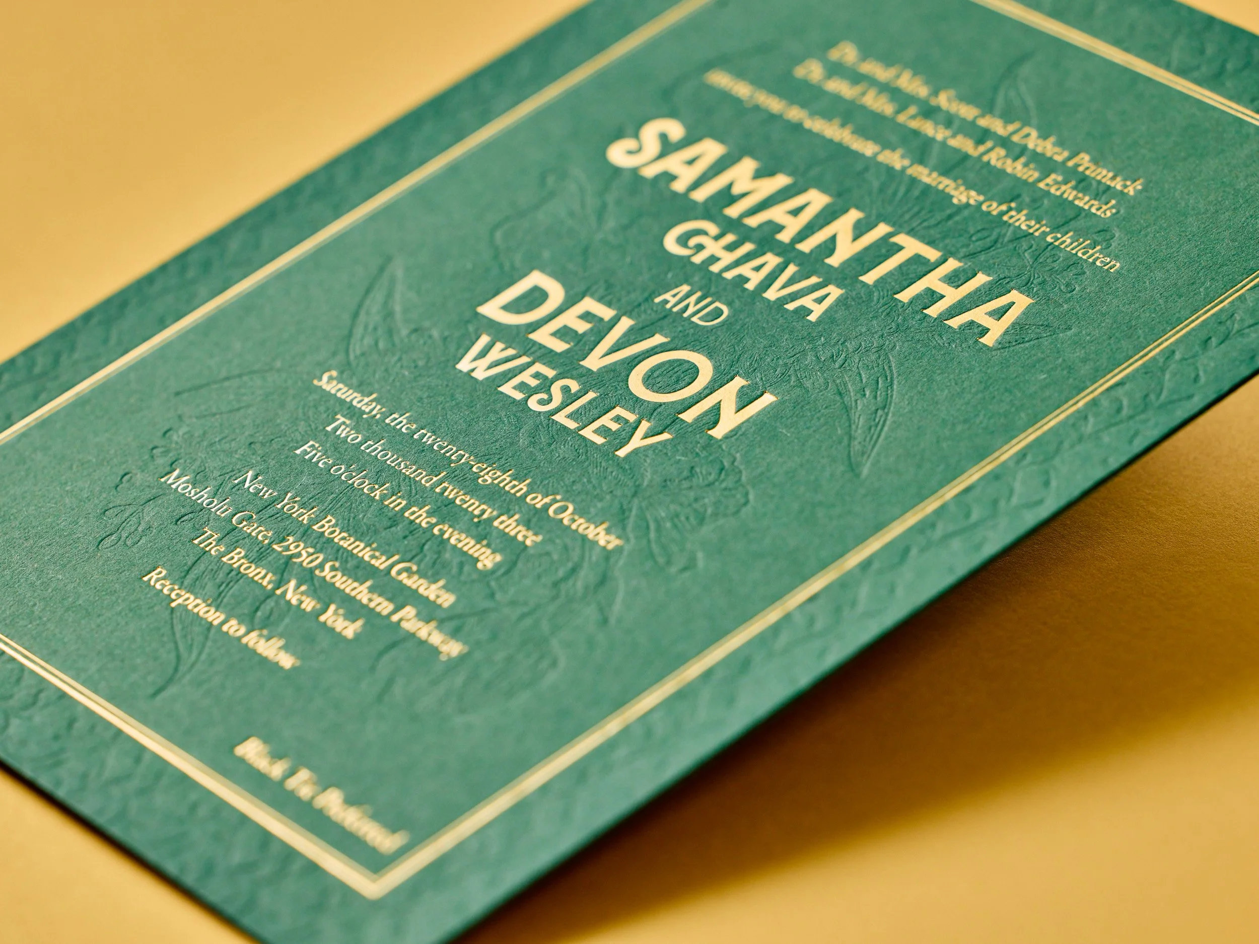
Botanical Green & Gold Wedding Invites
We worked closely with Samantha and Devon to come up with this invitation design for their New York Botanical Garden wedding. The color scheme and primary typeface are nice and bold, but the tonal letterpress details are super delicate. We printed on thick custom duplexed Colorplan stock so that it would hold up nicely to…
-
New Business Cards for Empress Brow
We’ve printed cards for the friendly folks at Empress a few times now. This time around, we helped develop a new design with artwork based on Emily’s tattoo, thick duplexed paper, and gold edge paint. PAPER Duplexed Colorplan Candy Pink & Lettra Fluorescent WhiteINK Custom Green & Pink, BlackEDGE PAINT Gold
-
Krafty Shade
These duplexed business cards were printed as part of a larger suite of collateral we worked on for the Hattiesburg landscapers at Shade. Everything was designed by Whitney Miracle, and she picked out an awesome combination of Kraft-Tone papers from French Paper Company along with platinum and pale green foils. PAPER Kraft-Tone Carbon Copy, Kraft-Tone…
-
Business Cards Barrett Ford
I never get tired of tonal ink on Colorplan paper. This one’s for Kelley of Barrett Ford Jewelry. We printed this little square business cards on 540g stock (not too thin, not too thick) with tonal green ink and gray ink, then finished them with gray edge paint. PAPER 540g Colorplan Powder GreenINK Custom Pastel…
-
Business Cards for A to Be Partners
We printed these cards with three inks per side on thick 600g Fluorescent White stock for fellow Portlanders A to Be Partners. Designed by Allison of Allison Arno Design.
-
Letterpress Logo Notes for Sixgill
Sixgill’s logo uses a gradation of green — from light on the left to dark on the right. Normally that’s not the sort of thing letterpress does well. But using a fine halftone screen, we printed two shades of green on top of one another to achieve the gradation effect.
-
Letterpress Invites in the Santa Cruz Mountains
This is one of our favorite client-designed wedding sets of the summer. Elaine and Joseph’s invites mimic the lush forest that surrounded their venue in the Santa Cruz Mountains, complete with ferns, pinecones, and slugs. We mixed a custom dilution of our Light Celadon ink to let the deep impression of the artwork really stand…
-
Letterpress Business Card Roundup
Time for another business card roundup! After you’re done here, you might want to check out previous roundups from 2013, 2014, and just this past January. Canadian designer and photographer Amanda Benincasa (benincasadesign.com) designed these cards, complete with a letterpress QR code. We printed them with custom green and gray inks on thick 600g Fluorescent White…