
Tag: fluorescent white
-
Growing Businesses, One Card at a Time
You know how sometimes you have to move thousands of pounds of antique machinery from one edge of the country to another, and then get it all set up properly so you can keep your business running? Wait, you don’t? Ah … count yourself lucky. Parklife Press moved from lovely North Carolina to beautiful Portland,…
-
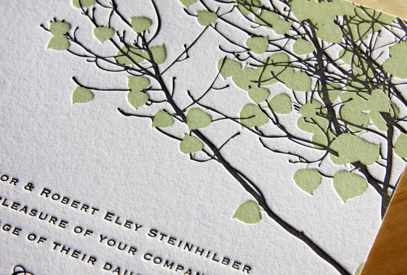
Perforation Perfection
This was a really fun set. Designed by graphic designer (and groom) Derek Howles — who, incidentally, also designs these super-cool cartography poster prints — it was interesting and unconventional. And art-y! Which is fitting, since they got married at the North Carolina Museum of Art. The set was comprised of a save the date…
-
Timeless Black on White
Michelle and Stephen weren’t familiar with letterpress when they began planning their black tie wedding, but a love of elegant invitations had been instilled in Michelle an early age. Her grandmother used to frame beautiful invitations she received, and Michelle had always admired those with simple black calligraphy on a white note card. Parklife’s Vignette…
-
A Handful of New Letterpress Business Cards
We’ve added some great new cards to our business gallery. Take a look… These double-sided cards for Cedarly, a media and web branding company in North Carolina, feature their logo printed with a tinted white ink. We could have just as easily blind-pressed the logo (no ink at all), but the tinted white helps it…
-
Durham, Via …
Megan and Ted had a bold, simple look in mind for their invitations. Both loved the clean look of the Futura typeface, which captured the wedding’s modern and traditional blend of styles. They first grabbed their guests’ attention with a save the date card, featuring a custom illustration by Travis, which traced the couple’s route…
-
Minimalist in Long Island City
After seeing the Parker invitation design featured in Martha Stewart Weddings, Liz and Adriel were drawn to the classic look of the invitation. They knew they wanted letterpress invitations; in Liz’s words, they were “choosing to send physical invitations in a digital world,” so the texture of the imprinted text and the feel of the…
-
Summer Vail
Emily and Dylan’s adaptation of our Vail invitation is great. We changed the Tangerine ink to Light Celadon and opted for Fluorescent White paper instead of Ecru and the look, once warm and autumnal, became bright and fresh — perfect for their summertime wedding. We carried the look through to the place cards and thank you…
-
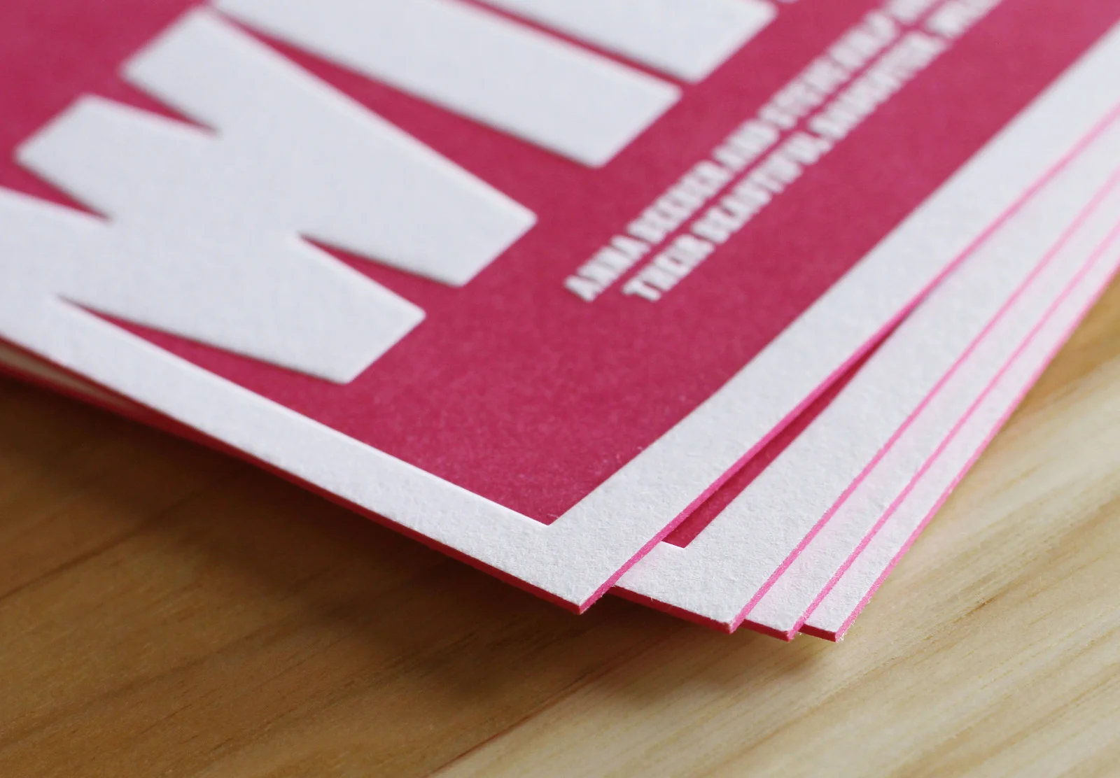
Fuchsia Baby Announcements
Large blocks of color can be tricky with letterpress. But if you don’t mind a little paper show-through, it can be very cool. We printed these announcements for local Chapel Hill designer, Steve Kulp, on 600g Fluorescent White paper with Fuchsia ink and edge paint. Using the extra-thick stock lets us press harder into the…