
Tag: fluorescent white
-
Letterpress Logo Notes for Sixgill
Sixgill’s logo uses a gradation of green — from light on the left to dark on the right. Normally that’s not the sort of thing letterpress does well. But using a fine halftone screen, we printed two shades of green on top of one another to achieve the gradation effect.
-
Foil + Foliage in the Brooklyn Botanic Garden
For Taryn and Adam’s wedding in the Brooklyn Botanic Garden, we designed a custom foil + letterpress motif based on the garden’s Palm House. Take a look at the inspiration: We carried parts of the artwork through to reply cards, menus, programs, and even the envelopes. PAPER 600g Fluorescent WhiteINK Light CeladonFOIL Silver Shine
-
Christmas Cards for Adena Studios
Check out these stark and sinister Christmas cards for North Carolina creative agency and long-time Parklife collaborators, Adena Studios. We printed these with Black and Fuchsia ink on our 300g Fluorescent White cotton paper.
-
Fluorescent Festivities | Neon Nuptials
These might be my favorite client-designed invitations this year. The bride, Nisha, designed three different invites for her various California wedding festivities. All three have a common feel — employing the same border art, black ink, and copperplate type. But Nisha used different title art for each and we printed them with three different fluorescent letterpress…
-
50th Anniversary Surprise
After the overwhelming success of Elisa’s invitation set last spring, she’s back with party invitations for her parents’ anniversary.
-
Biz Cards by Floc5
Here we’ve got a couple of sweet business cards designed by Sarah at Kansas City’s Floc5. Connect with them on twitter (@floc5) or at their website. The first is for Floc5 Homes — printed in rich black ink on thick, bright 600g Fluorescent White cotton stock. Next we’ve got skinny cards for Amy Slattery of the…
-
Blind-Pressed Garden Invitations
We printed these oversized invites for the friendly folks at Frou Frou House with a very light cool gray ink and a deep blind impression. They’re printed on our 600g Fluorescent White stock sized for large A9 envelopes.
-
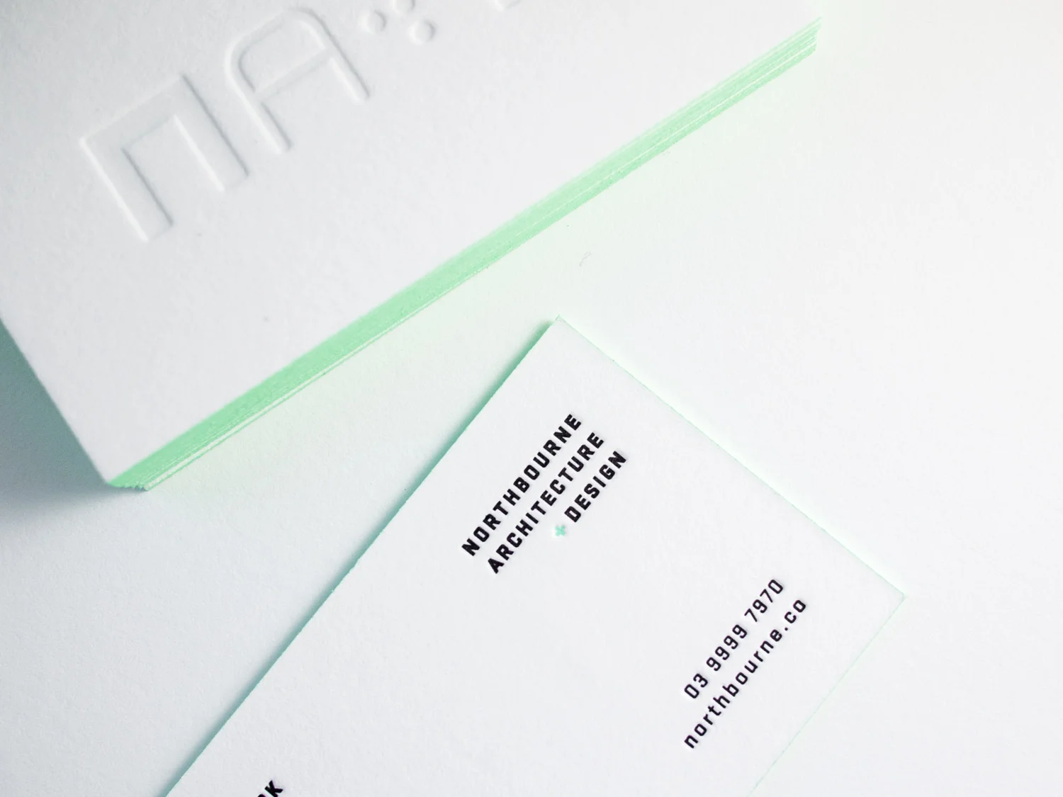
Minty Cards for Northbourne Architecture + Design
These striking cards for Melbourne architecture firm Northbourne were printed on 600g Fluorescent White Lettra with a blind impression on the front and black and custom mint ink on the back. Finished with mint edges match. Printed by Parklife and designed by JT at A Door Ajar.
-
A Golden Hex
Bax’s cards presented a special challenge. Normally, to create an odd shape (basically anything non-rectangular), we’d make a die and die-cut the cards. But Bax wanted edge paint — and a die-cut edge isn’t crisp enough to paint cleanly. So we (very carefully) knife-cut these 600g fluorescent white hexagons with our 19th century guillotine cutter,…
-
Red Flooded Business Cards
Solid floods of color can be tricky with letterpress. But if you play your no-pun-intended cards right, you can get great results. Lighter/brighter colors tend to print more evenly. And die-cutting the cards rather than knife trimming can help keep the raised unprinted paper from getting squished or scuffed. For these square cards we printed…