
Tag: blue
-
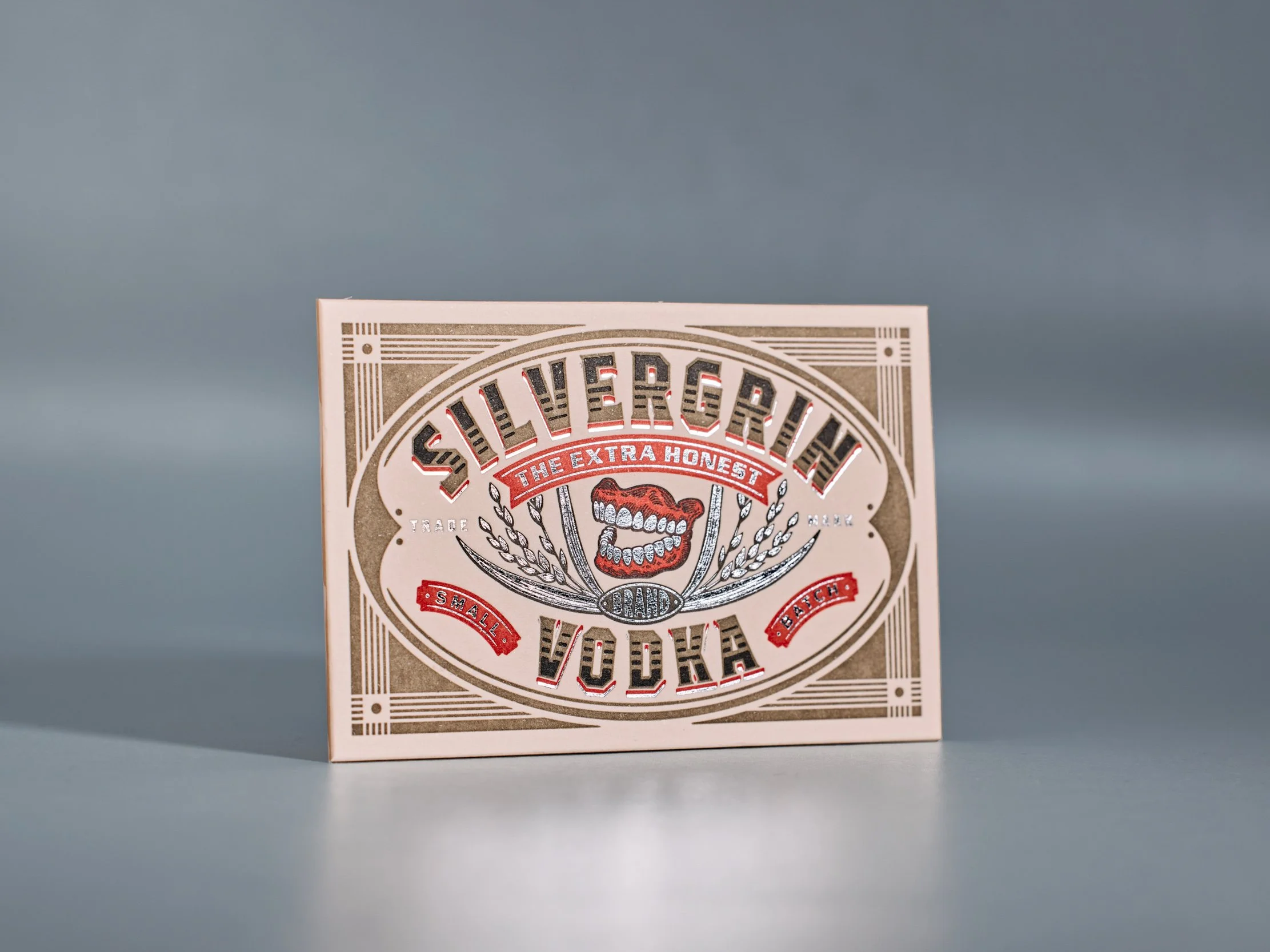
Business Cards for Silvergrin and Sespe Creek Distilleries
The first of two business cards we printed for clients of the incomparable designer Chad Makerson Micheal. This one’s kinda nuts: A duplexed card with three letterpress inks plus sliver foil on the front, three letterpress inks on the back, glued and die-cut. Super tight registration on the inks and foil all around. PAPER Duplexed…
-
Letterpress Logo Notes for Sixgill
Sixgill’s logo uses a gradation of green — from light on the left to dark on the right. Normally that’s not the sort of thing letterpress does well. But using a fine halftone screen, we printed two shades of green on top of one another to achieve the gradation effect.
-
Fluorescent Festivities | Neon Nuptials
These might be my favorite client-designed invitations this year. The bride, Nisha, designed three different invites for her various California wedding festivities. All three have a common feel — employing the same border art, black ink, and copperplate type. But Nisha used different title art for each and we printed them with three different fluorescent letterpress…
-
Business Cards for Dixon Kirby
Another G Brand design, this one for design and builders Dixon Kirby. These are duplexed cards, printed with two inks on Pearl White Lettra for the front, and one ink on Adriatic Colorplan for the back.
-
Stationery Fit For a Dean
Walt’s stationery design is simple, but deceivingly so. We printed the three-color piece on 5×7 cotton paper with a fine halftone screen in the lighter blue ink pass, creating the illusion of a third blue — lighter than the lines that outline the abstract wave shape.