
Tag: black
-
Gold on Black for Nequette Architecture + Design
Perhaps you’ve seen some of Chad Martin’s design work on this very site in the past (here, here, here, or maybe here). For this set, we printed cards for Nequette Architecture & Design along with some similar cards for Chad’s company, The G Brand. These mini 1.75″ x 3″ cards feature gold ink on 30pt…
-
Holographic Foil For Bakedown Cakery
We first met Jen back in 2014 when we printed the wonderful invitation set she designed. Since then she’s been hard at work building her cake-baking empire at Bakedown Cakery. Check out her work below, and if you don’t get too distracted by the cakes, scroll down to see the awesome duplexed letterpress + holographic…
-
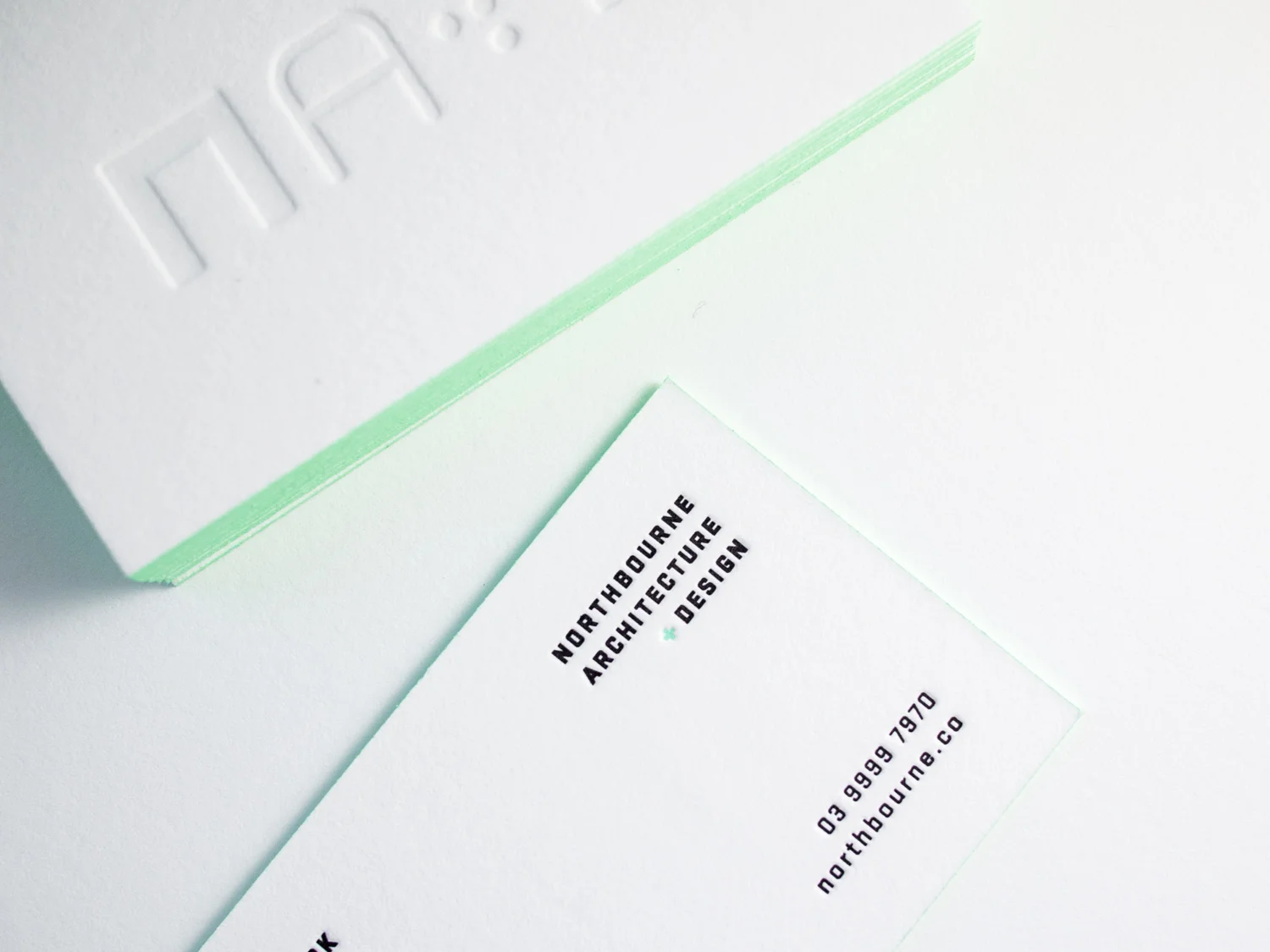
Minty Cards for Northbourne Architecture + Design
These striking cards for Melbourne architecture firm Northbourne were printed on 600g Fluorescent White Lettra with a blind impression on the front and black and custom mint ink on the back. Finished with mint edges match. Printed by Parklife and designed by JT at A Door Ajar.
-
A Golden Hex
Bax’s cards presented a special challenge. Normally, to create an odd shape (basically anything non-rectangular), we’d make a die and die-cut the cards. But Bax wanted edge paint — and a die-cut edge isn’t crisp enough to paint cleanly. So we (very carefully) knife-cut these 600g fluorescent white hexagons with our 19th century guillotine cutter,…
-
Red Flooded Business Cards
Solid floods of color can be tricky with letterpress. But if you play your no-pun-intended cards right, you can get great results. Lighter/brighter colors tend to print more evenly. And die-cutting the cards rather than knife trimming can help keep the raised unprinted paper from getting squished or scuffed. For these square cards we printed…
-
Business Cards for Virile Heart & Heritage
For the New Jersey grooming gurus at Virile, we printed these thick two-sided cards on 600g pearl white Lettra with tinted white and black inks. We finished them with a rich brick edge paint. To help the impression pop, we like to use white ink tinted with a little bit of silver rather than print…