
Category: wedding invitations
-
Durham, Via …
Megan and Ted had a bold, simple look in mind for their invitations. Both loved the clean look of the Futura typeface, which captured the wedding’s modern and traditional blend of styles. They first grabbed their guests’ attention with a save the date card, featuring a custom illustration by Travis, which traced the couple’s route…
-
Minimalist in Long Island City
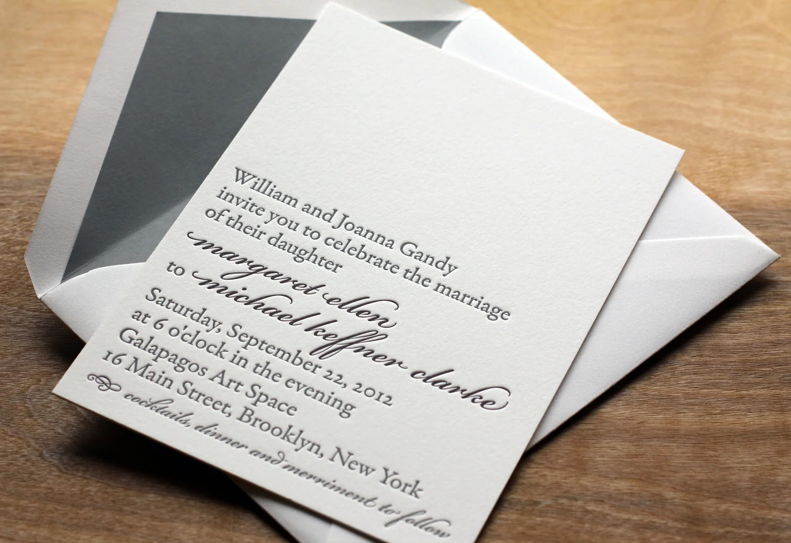
After seeing the Parker invitation design featured in Martha Stewart Weddings, Liz and Adriel were drawn to the classic look of the invitation. They knew they wanted letterpress invitations; in Liz’s words, they were “choosing to send physical invitations in a digital world,” so the texture of the imprinted text and the feel of the…
-
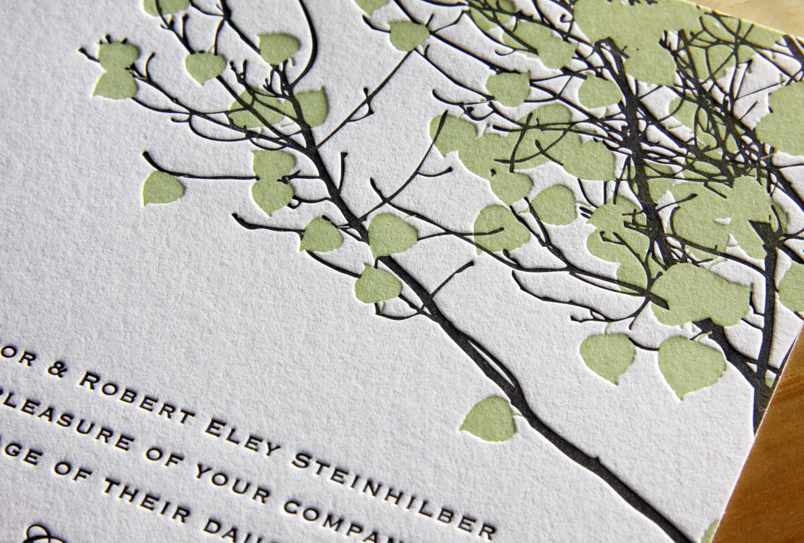
A Letterpress Wedding in Aurora
Kristin and Alex’s set was a lot of fun to print. We started with save the date coasters featuring custom pen and ink drawings (by Travis) of the wedding venue printed on our 600g cotton paper. Save the dates are often less formal and more playful than the actual invitations, so it seemed like the perfect…
-
Summer Vail
Emily and Dylan’s adaptation of our Vail invitation is great. We changed the Tangerine ink to Light Celadon and opted for Fluorescent White paper instead of Ecru and the look, once warm and autumnal, became bright and fresh — perfect for their summertime wedding. We carried the look through to the place cards and thank you…
-
Scripted Bookplate
In this variation on our Bookplate invite Maggie and Mike softened the look a little bit by adding some Bickham Script type in Deep Plum ink for their names and the reception line. Slate envelope liners to match the Slate ink give the set some added polish. Rather than over-stuff the envelope with accommodations info,…