Category: wedding invitations
-
New York Garden Wedding Whimsy
It can be tricky to create a wedding invitation suite that’s colorful, playful, and exciting, while still conveying the sophistication of the event itself. While working with Terisa and Tom, the goal of maintaining that balance was always at the front of our minds. Ok, sure, the save the dates leaned a bit toward the whimsical…
-
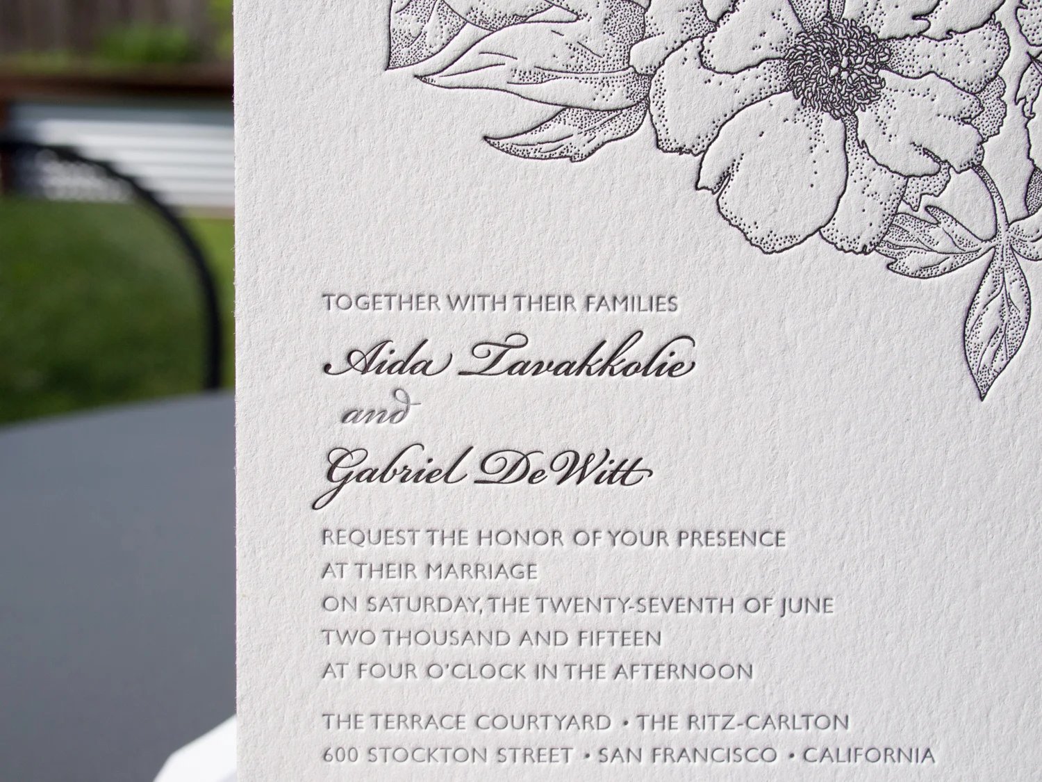
Golden Botanicals Wrapped & Sealed
If you thought the letterpress save the dates we printed for Randi & Ben this spring were cool, I think you’re gonna like the follow-up. This was truly a collaborative project. Randi designed the two-sided invitation and sleeve, and sent the specs off to us. We printed the front of the invitation on 300g Pearl…
-
A Wedding Between Two Ferns
Last month we featured Luke and Robyn’s Mount Hood wedding invitation set. Sticking with the Oregon theme, this time we head south for Julia and Detlev’s wedding on the Umpqua River. Both the wedding ceremony invitation and the rehearsal dinner invite feature fern imagery – somewhat abstractly on the main invite and more realistically and delicately for…
-
Foiled & Monogrammed
We love type-only designs. This one’s got a simple monogram in Italic Garamond along with text in Neutra Light and Sloop Script. We used a custom paper — two sheets of Dark Gray 350g Colorplan duplexed to create a nice, thick 700g stock. The card was printed with silver foil, finished with silver edge paint, and…
-
Foil, Door Tags, and Alligators
It’s great when we get to work with a wedding client from the very beginning – starting with the save the dates, moving on to the invitations, and then following through to the wedding day pieces. We did this for Elisa and Alexander, shifting the design vision slightly throughout the process while still maintaining a cohesive…
-
Mid-Century Modern Floral
This lively set was based on a 60’s style botanical motif printed in two shades of green. Designed by the bride (between her cake-baking sessions), the set was printed with two custom inks on 600g fluorescent white stock. First, a square save the date card — emphasis on the date. The playful greens grow inwards from all…
-
Custom Monogram in Santa Fe
Ah, the blind-pressed monogram. Hard to go wrong when you use a lightly tinted white ink with a deep impression on thick cotton paper. We carried the variations of the monogram through to each piece — an accommodations card with a tear-off reply card, a menu, table numbers with a blind chevron pattern and inkjet numbers, and programs…