
Author: Travis Friedrich
-
Foil, Door Tags, and Alligators
It’s great when we get to work with a wedding client from the very beginning – starting with the save the dates, moving on to the invitations, and then following through to the wedding day pieces. We did this for Elisa and Alexander, shifting the design vision slightly throughout the process while still maintaining a cohesive…
-
Anniversary Foil
For us, 2015 has been the year of foil. Check out these awesome foil stamped employee recognition cards we printed for Canada’s Ian Martin Group. All six sets were printed with gold foil on 600g Ecru Lettra paper, then finished with gold edge paint.
-
Letterpress Stationery for Palette & Parlor
As we were moving Parklife Press from North Carolina out to Oregon last summer, Ivy and John were bringing their Chapel Hill furniture studio into full swing. We’re no longer in the same town, but that doesn’t mean we can’t still work together. We printed note cards and business cards with custom inks on 300g…
-
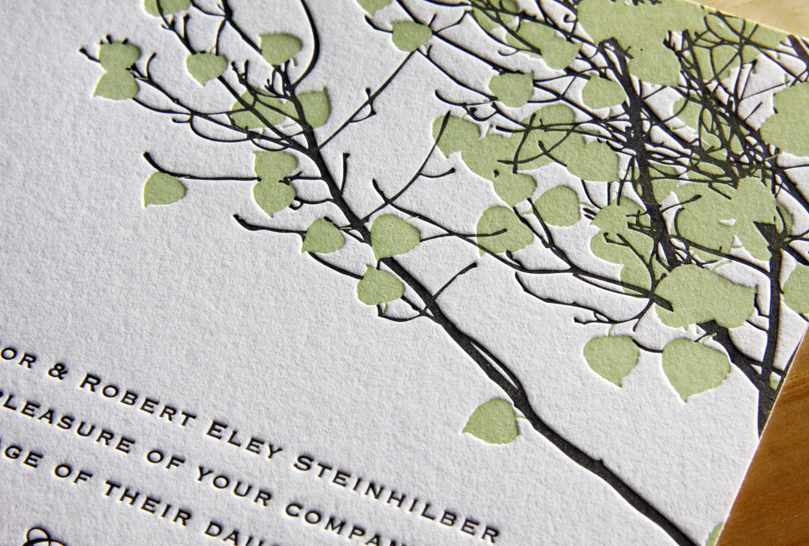
Botanical Postcards
This two-sided client-designed save the date postcard combines light warm gray letterpress ink for the front with flat inkjet printing on the back. The botanical image has wonderful ornate detail while the R+B monogram on the back is simple and clean. The two styles work beautifully together. When printing two-sided, we can use letterpress for both, but it’s…
-
PDX Sports Fan Letterpress Coasters
Looking for the perfect gift for your beverage-sipping Portland sports fan friend? Well shoot, these aren’t for sale. But if they were, they’d be perfect… if not a little pricey. We printed the Timbers side with two inks on 300g Fluorescent White Lettra. On the opposite side, we printed a modified Trail Blazers logo with silver and red inks on…
-
Lavender & Mint in Scappoose
Here’s a lovely wedding set for Parklife’s favorite brother and his favorite new wife. For the save the date we used two custom inks on thick 600g ecru paper. For the invitations, we carried through the same inks, paper, along with a few variations on the Gotham typeface. On the back of the invitation we added…
-
A Letterpress Wedding in Aurora
Kristin and Alex’s set was a lot of fun to print. We started with save the date coasters featuring custom pen and ink drawings (by Travis) of the wedding venue printed on our 600g cotton paper. Save the dates are often less formal and more playful than the actual invitations, so it seemed like the perfect…
-
Summer Vail
Emily and Dylan’s adaptation of our Vail invitation is great. We changed the Tangerine ink to Light Celadon and opted for Fluorescent White paper instead of Ecru and the look, once warm and autumnal, became bright and fresh — perfect for their summertime wedding. We carried the look through to the place cards and thank you…
-
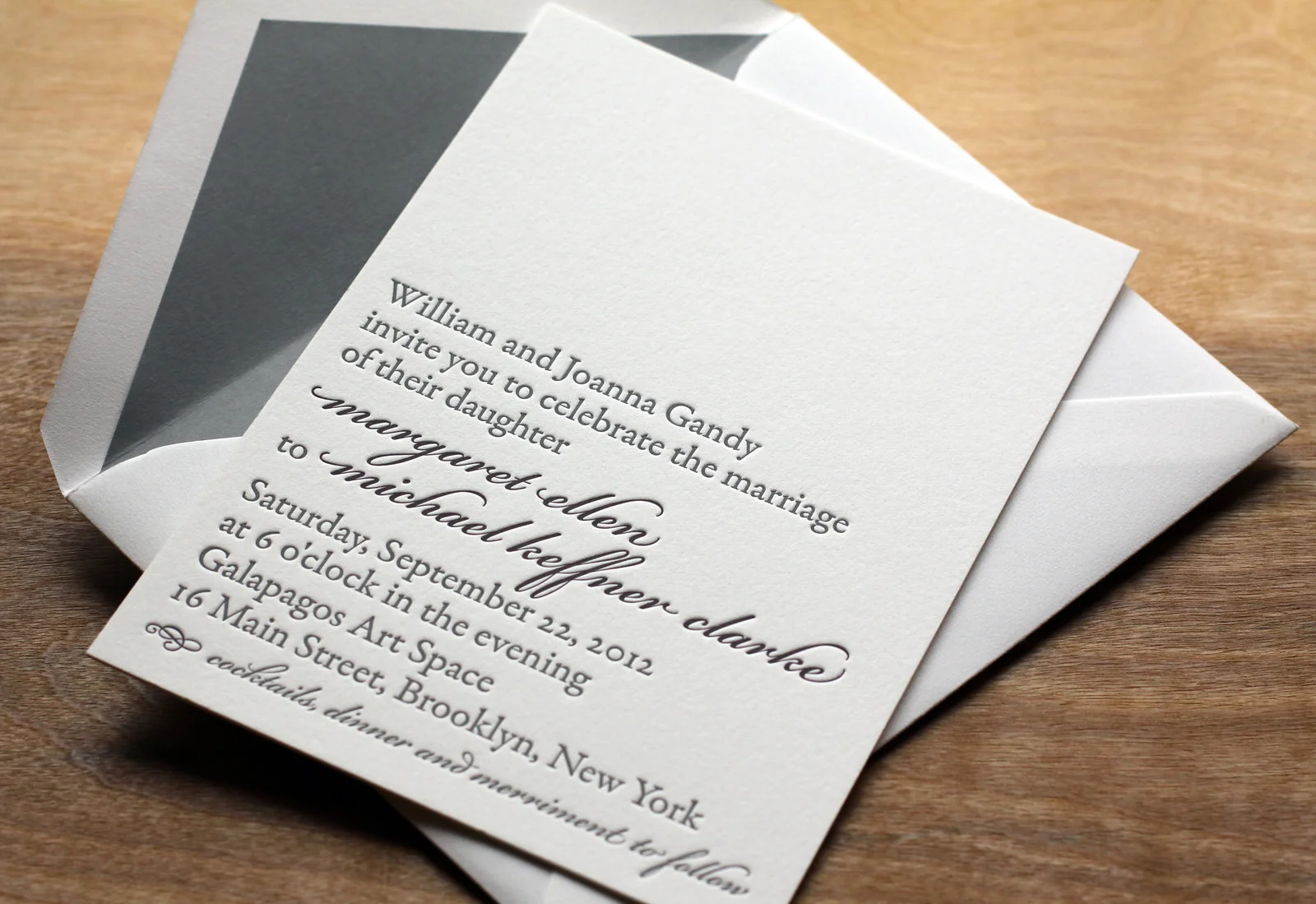
Scripted Bookplate
In this variation on our Bookplate invite Maggie and Mike softened the look a little bit by adding some Bickham Script type in Deep Plum ink for their names and the reception line. Slate envelope liners to match the Slate ink give the set some added polish. Rather than over-stuff the envelope with accommodations info,…
-
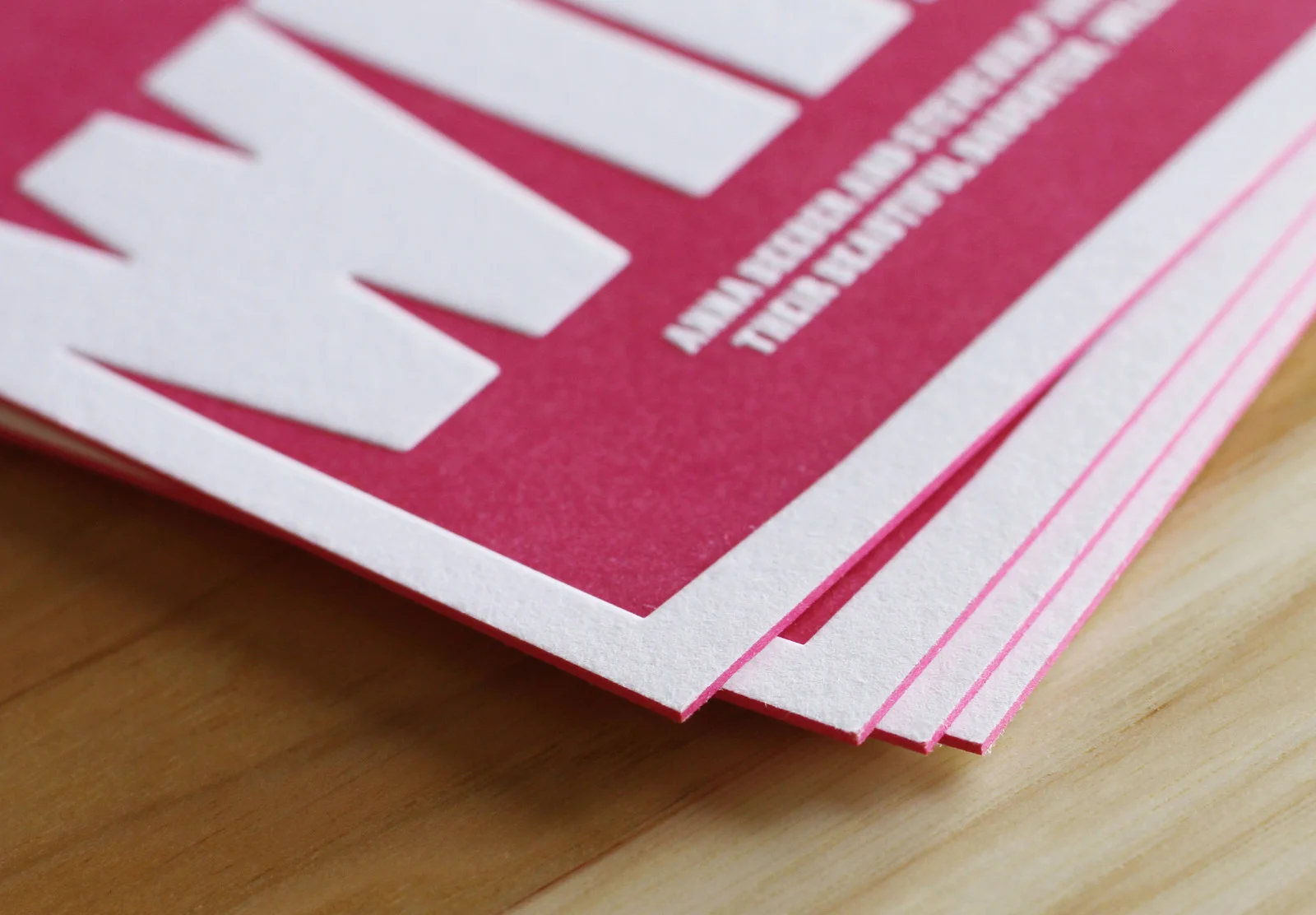
Fuchsia Baby Announcements
Large blocks of color can be tricky with letterpress. But if you don’t mind a little paper show-through, it can be very cool. We printed these announcements for local Chapel Hill designer, Steve Kulp, on 600g Fluorescent White paper with Fuchsia ink and edge paint. Using the extra-thick stock lets us press harder into the…