
Kevin and Francesca were looking for an invitation to echo the
embroidery on the bridal gown. They found what they were looking for, basing
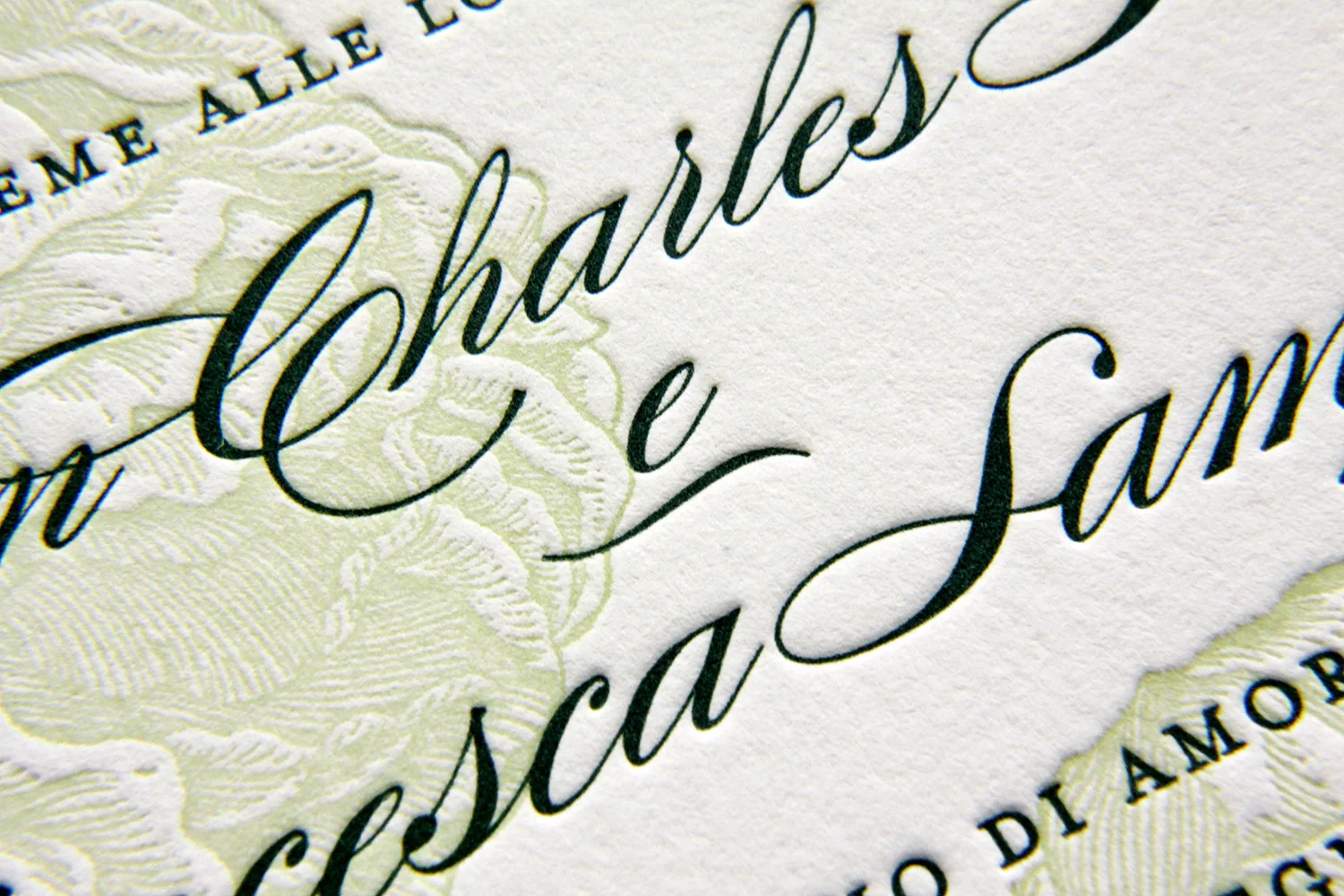
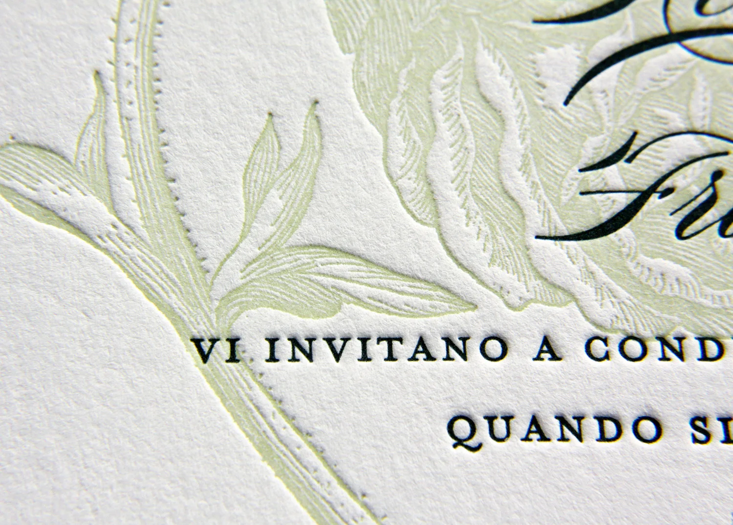
their set on Parklife’s Franklin
design. The springy floral motif was also reflected
in the design of the wedding cake and in the floral arrangements.
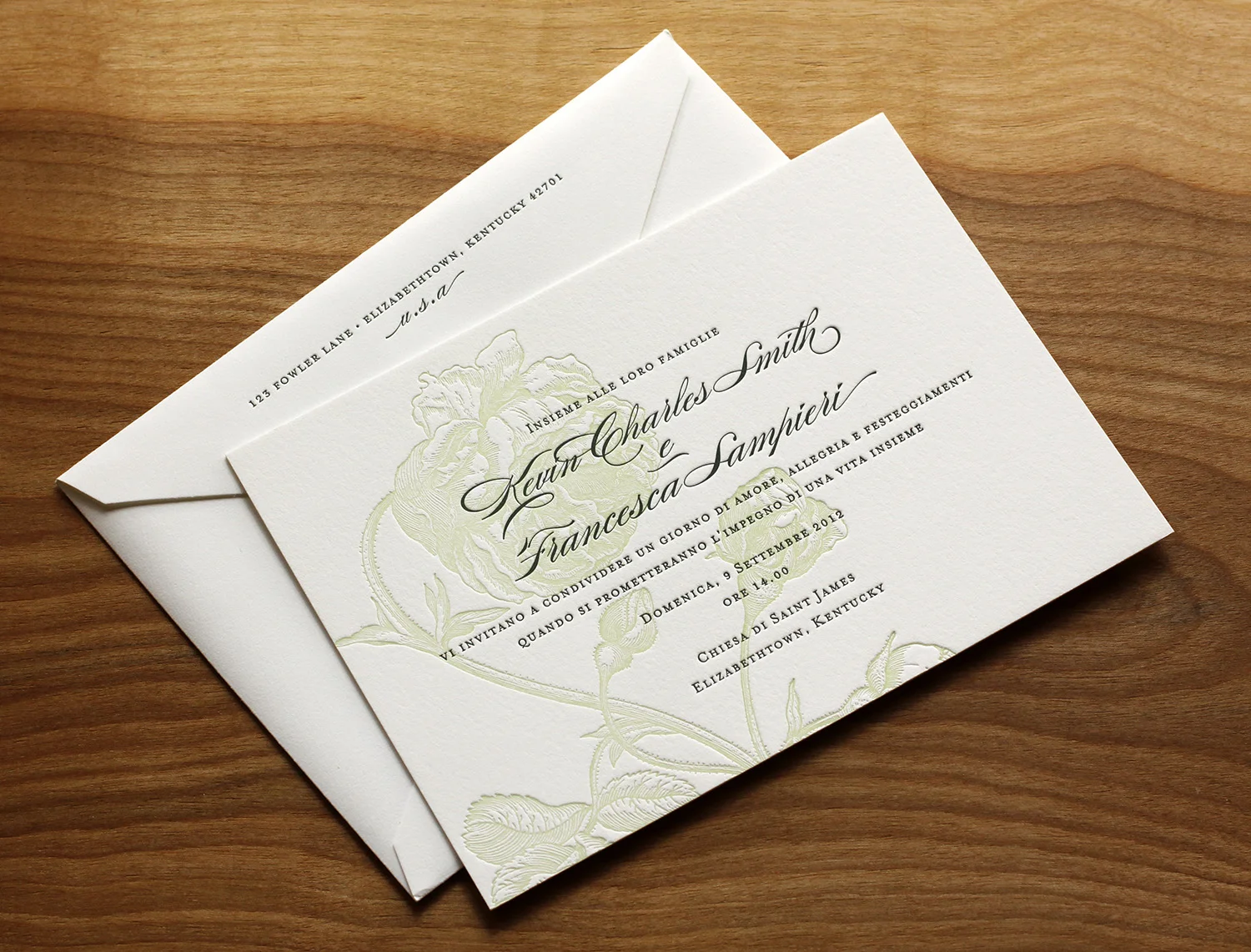
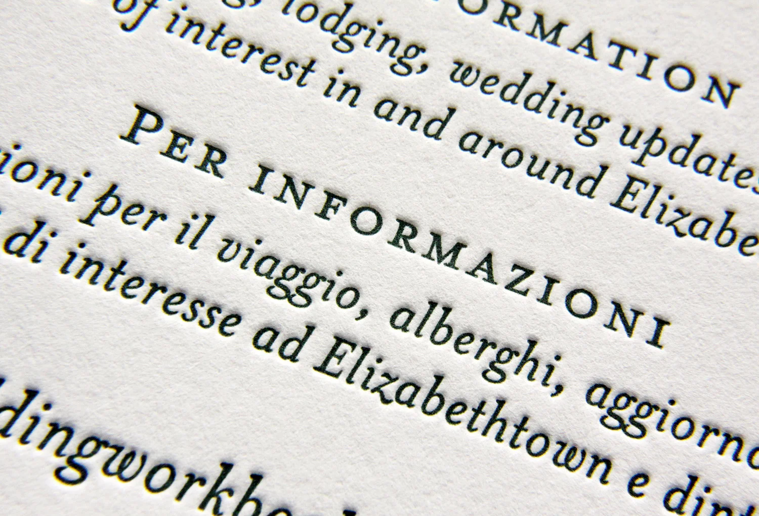
The other major requirement for the invitations was that they speak to
two audiences, which had, as Francesca put it, “different traditions and
etiquette requirements.” The floral artwork was printed with a single plate in light celadon ink. But for the forest green text, two different plates were used — one in English and one in Italian. The
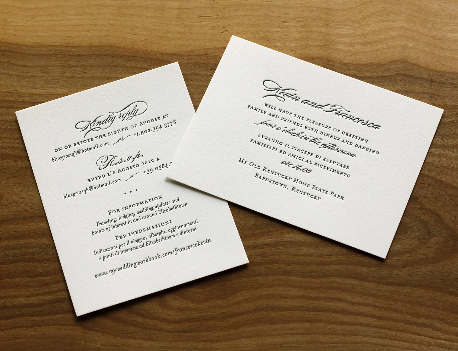
enclosure cards were bilingual to speak to both audiences — one card
invited guests to the reception, the other gave RSVP directions and other
information. “Everyone invited, from every country we touched, made the
comment that they’d never seen such a simple yet elegant touch and
attention to details in the invitations.”
“The invitations for our wedding were probably one of the best things
of the wedding organization,” Francesca said. “We could not be any more
pleased by the success of the first step of the best day in our lives.
We have been recommending Parklife Press to whomever asks for refined
letterpress work.”
Leave a Reply